 Caption: A Small Portion of the Spreadsheet Comparing Old and New Precincts
Redistricting here in the US is significant on many levels. At the macro level, it CAN determine which party controls the US House of Representatives, and many aspects of government at the state and local level. At the micro level, it determines the groups of people with whom the members of each household gets to vote for any given position in government. More subtly, it can also affect motivation to get out to vote, which can affect the more localized as well as the presidential and statewide elections. This is not intended to be an exhaustive treatment of the effects of redistricting, so will stop here.
Overview of Comparison
As we were going through redistricting here in the Harris County, TX area in the past several weeks, one of the first things we received was a compilation of precinct maps for each precinct. These maps attempted to show the maps of the old precincts and the new precincts, each with some indication of how it was affected by redistricting. Perhaps these representations might be useful to an individual trying to see where they stand, but they weren’t all that useful in trying to get your head around the changes at more of a macro level. Here is the Proposed Plan for New Election Boundaries provided by Harris County administration.
There are things that can be easily concluded from these maps, but they are quite difficult to use in general:
- Prior to redistricting, there were 1012 precincts vs. 1152 after
- You can view the shapes of the prior precincts and of the new precincts, but it is difficult at best to tell any real relationships between the old and the new
- You can find yourself in the old set of maps and you might be able to also find yourself in the new set
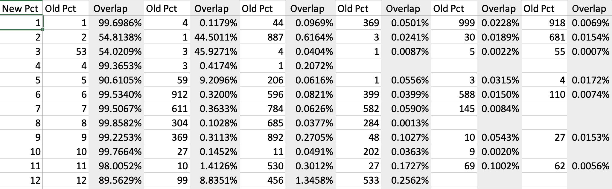
Unfortunately, when we started looking at this, redistricting was still being challenged in the courts, and consolidated Geophysical Information Systems (GIS) map file bundles were apparently not available. They were made available to us on Friday, 7Jan2021. Over that weekend, I implemented a comparison method that’s interesting and helpful. A part of that comparison is shown in the image at the top of this article.
Working with GIS Maps and Mapping Software
I’ll attempt to make this quick and hit only the high points. What we are talking about is drawing shapes on a map. That’s what’s shown in the above precinct files from the Harris County Administration, and that’s what you see when you view Google/Apple Maps. These maps are all pretty special. The shapes you see are drawn and recorded using a special coordinate system that allows a properly equipped program to make fairly accurate computations about those shapes comprehending the curvature of the earth.
While you CAN draw shapes computationally, most shapes are drawn by a person in front of a computer screen. This becomes somewhat important when the shapes this person is drawing defines the boundary between 2 or more shapes. This is somewhat error prone, so you can end up with all sorts of unintended overlaps between shapes. Most of these overlaps are very small and probably not significant. To be significant in the case of either the old or new precincts, we would need to know whether any residences are within these overlapping areas. If they are, then that means those residences will show up in 2 or more precincts. That’s a problem, but there probably aren’t any cases like this. If there are cases, they have or will be found and corrected. I didn’t do any of that checking as much more data would be required - mainly “parcel” shape files representing all residences in the area of interest.
Old to New and New to Old Precinct Comparisons
I generated a Harris County, TX comparison of each old precinct vs. all new precincts and then each new precinct vs. all old precincts. I suggest you review the process outlined below before spending too much time viewing the spreadsheet, but maybe it’s more self-explanatory that I think. The comparison process at a fairly high level is as follows:
- Get all old precincts
- Calculate the area of all old precincts and record that area
- Take each old precinct one at a time
- Find all new precincts that overlap with the current old precinct
- Calculate the overlap areas and record
- Sort the overlaps in decreasing order
- Place the old precinct number in column 1, followed by the series of new precincts that overlap paired with the percentage of overlap of that precinct
- Repeat with new precincts vs. old precincts
- Place all data in 2 tabs of a spreadsheet
- Sort each tab by decreasing overlap of the first overlap column (I think it’s more useful to leave the file in ascending order of the prevailing precinct so will do so - the conclusions below were drawn when the sheets/tabs were sorted as pointed out in this bullet item)
Sounds simple - right? If you know how to do it, it’s not horrible, but there are a whole bunch of layers to the knowledge upon which you must build to make something like this happen.
In any case, that’s what you should see when you click on the spreadsheet above. I find the Rel_Old tab to be more useful. What you will see there is the following:
- The Rel_Old table says “if you were in precinct “n”, the you will be in one of the listed “New Pcts” listed to the right on the same line.
- The first 11 precincts are overlapped 100 %. This doesn’t mean the old precinct “equals” the new precinct (recall the discussion above about the shapes being hand drawn, and the boundary “errors” that causes). The lack of small “errors” indicates to me that these 11 precincts have been “swallowed up” by larger new precincts. In fact, I just checked all 11 of these, and they are comically small precincts. Some do have Democratic Precinct Chairs.
- The rest of the rows/old precincts overlap with 2 or more new precincts.
- Vanishingly small overlap percentages can probably be ignored (likely no households within)
- At some point, the overlap percentages become large enough. More information is required to analyze further.
- The range of major overlap (first overlap column) is ~ 35.7 % to 100 %.
- The major overlap (first overlap column) for just over 200 old precincts falls under 90 %.
Summary
This was a fascinating exercise for many reasons - and not least for learning and relearning what one can do with GIS capable software! There was a whole lot of shifting going on with this redistricting. The shifting was not limited to just precincts, either. At least one of our Senate Districts shifted enough to separate some of their leadership with many long-term constituents. We should hope that most, if not all, of the strong contributors we’ve come to count on get shifted into party positions that will continue to allow them to be strong contributors.